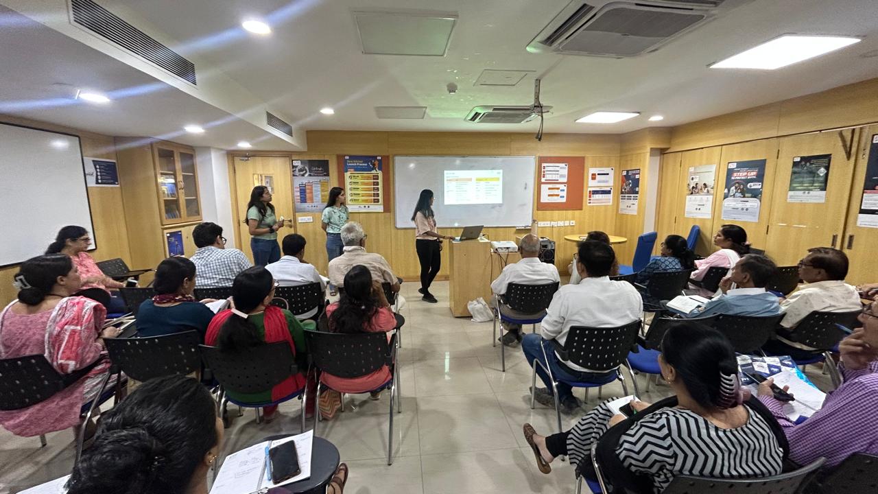
Prepared for


The problem
Max Life's agents were running their entire workday across a fragmented set of sales and enterprise apps — each with its own login, its own dashboard, its own logic. The same customer data got entered in multiple places. There was no shared calendar, so managers had no visibility into field activity. Nothing told an agent what to do next — they just remembered, or didn't.
The cost wasn't abstract. It was hours lost every week to logging in, switching context, and manually piecing together information that should have lived in one place.
Context
Max Life is a 20+ year old insurer that sells primarily through field agents, not direct channels. The people this was built for weren't sitting at desks — they were between customer visits, logging meetings on a phone, checking targets mid-day. Any friction had a direct cost in missed sales activity, not just frustration.


My role
I worked on mSpace as one of three designers, leading research synthesis, information architecture, and interaction design across the full product — login, dashboard, calendar, notifications, learning and training, application tracker, and menu. While the team divided feature areas, the end-to-end UX thinking — how the system held together, what questions needed answering before a screen got designed — was mine to drive.
Timeline: 6+ months, end-to-end
Team: 3 designers
My scope: Research synthesis · IA · User flows · Interaction design · Usability Testing · Stakeholder presentations · Dev Handoff
The problems we were solving
Agents logged into multiple apps separately — no single entry point
Performance and task data lived in disconnected dashboards
No shared calendar — managers had zero visibility into field activity
No guidance on what to prioritise or do next
Different usage experience with each application
No centralised way for agents to track learning, pending applications, or notifications — activity that lived outside the main dashboard but was critical to their daily workflow.
Gaps kept surfacing mid-project — not always from missed design decisions, but from scenarios business hadn't fully mapped during research. Edge cases that only became visible once a real flow was in front of someone.
The calendar feature is the clearest example. I started with colour-coding to distinguish meeting types. On paper it seemed logical. In practice, once the real range of meeting types was laid out, the system broke down — too many categories, not enough visually distinct colours, no logic an agent could reliably remember in the field.
Instead of iterating endlessly in Figma, I went back to paper. Rough sketches let me rethink the flow itself, not just its visual treatment. And wherever a flow raised a question only business could answer, I annotated it directly on the screen — so when I brought it to stakeholders, they could see exactly where the ambiguity lived, not just hear me describe it.
The ACR gap in the leads flow is another example — a document agents complete during lead follow-up that research hadn't surfaced at all. It only appeared once real agents were using the prototype.

What we built
1. One login, biometric-first
The problem: Every agent started their day by logging into multiple apps separately. Each one required its own credentials — a daily tax on people who needed to move fast.
The trade-off: Biometric login requires device permissions and doesn't work on every handset. We designed a fallback PIN flow for cases where biometric wasn't available. It added scope, but removing it would have left a gap in a tool meant for 100% of the field force.
What we did: A single entry point with fingerprint or face authentication replaced all separate logins. The screen itself was stripped back — background image removed, unnecessary copy cut, branding minimal but present. First-time users saw a short onboarding flow that walked through permissions rather than landing cold on a blank screen.

Biometric login to improve the security and convenience
2. A dashboard that acts, not just reports
The problem: Agents checked numbers in one app, tasks in another, targets somewhere else. Nothing connected. The information existed — it just lived in the wrong places.
The trade-off: Connecting nudges to real performance data (rather than generic reminders) meant the recommendations were only as good as the data feeding them. We accepted that limitation because a nudge not grounded in someone's actual numbers is just noise — it gets ignored within a week.
What we did: A centralised dashboard surfaced performance and activity in one place. A Performance Hub showed targets against achieved numbers with a progress bar and shortfall status, filterable by month, quarter, or year. Personalised nudges suggested each agent's next best action based on their current performance and role — not a static checklist, but a recommendation tied to where they actually stood.
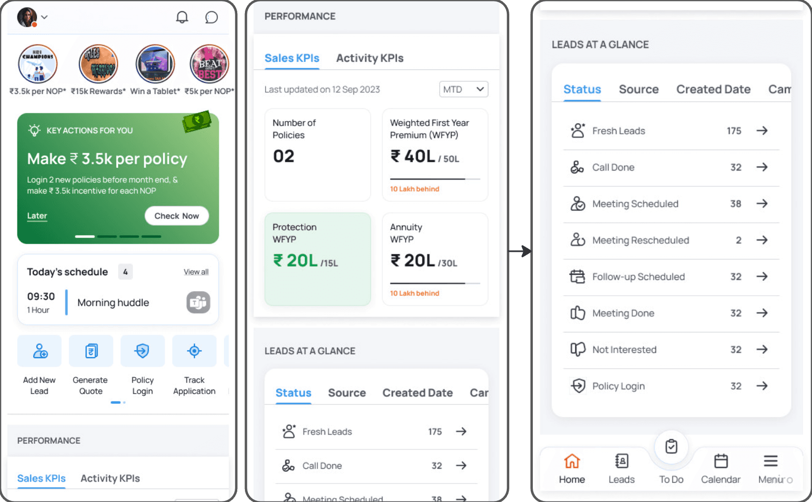
User can see all the performance-sales, activity, policy login, KPI on the dashboard at a glance. Supervisor roles can also track subordinates performance
When development changed the constraint
When the dashboard went to development, we hit a late-stage technical constraint: the backend could only fetch raw numbers — metric names and values. The relational data needed for progress bars, shortfall calculations, and achievement states couldn't be served.
The original design — tabs, progress bars, shortfall in policies and rupees — couldn't be built as designed.
Rather than accept a plain grid of numbers, I redesigned the performance section into a compact card. The MTD filter stayed, a "last updated" timestamp was added for trust, and a "View Details" link preserved the path to deeper data. Four key metrics in a clean 2x2 grid — not everything we planned, but still designed, not just functional.
The trade-off was real: agents lost the at-a-glance shortfall context that made the original design actionable. That's something I'd push to solve properly in a future iteration — either by working with the backend team earlier to scope what data was actually fetchable, or by designing the fallback state before it became a late surprise.

Original design: tabs, progress bars, shortfall

Developer constraint: plain grid, raw numbers only
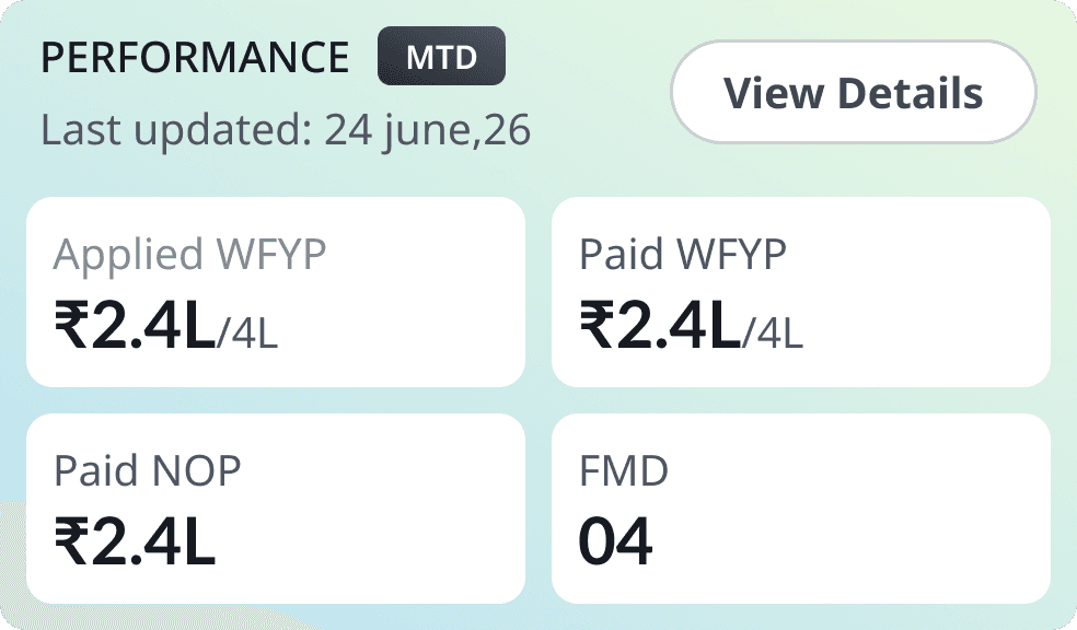
Redesigned card: compact, MTD filter, View Details Label each clearly
3. A shared calendar with real supervisor visibility
The problem: Managers had no reliable window into what was happening in the field. Agents had no central place to plan or log customer meetings. Planning happened in silos — if it happened at all.
The trade-off: Early designs used colour-coding to distinguish meeting types. Once the real range of meeting types was mapped out, the system broke down — too many categories, not enough visually distinct colours, no logic an agent could remember mid-field. Instead of iterating endlessly in Figma, I dropped back to paper, rethought the flow itself, and landed on status tags. Simpler, scalable, no colour memory required.
What we did: The calendar let agents log, schedule, and update meetings in one place. Supervisors got visibility into their team's activity — permission-based, not surveillance — closing the planning blind spot without requiring agents to file separate reports. A floating action button made adding a meeting fast. Route planning helped agents sequence their day. Meeting status was communicated through tags, not colour.
The agent and supervisor views are two sides of the same data — an agent logs a meeting, the supervisor sees it across the full team view.
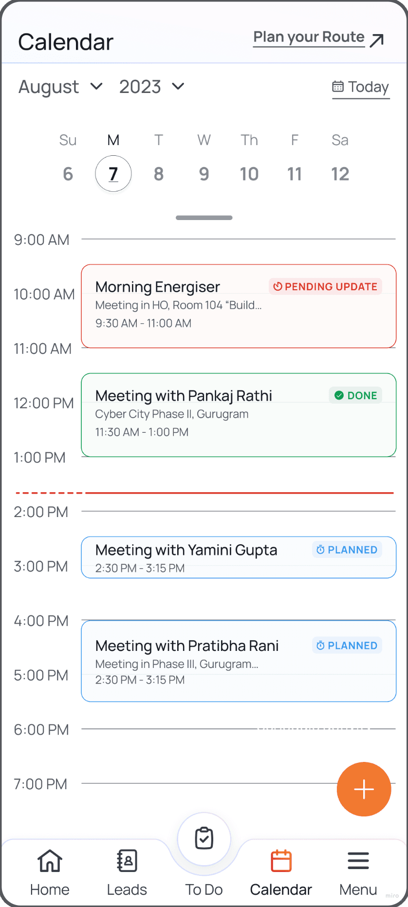
Early version: colour system broke down at scale."

Agent logs a meeting → supervisor sees it across the full team.
Scope of the full system
Beyond the three core flows above, mSpace covered the full agent workday end to end:

Usability testing — what changed
We tested with real agents across three rounds. Four findings directly changed what shipped.
Finding 1 — Agents think in policies, not percentages
KPI cards originally showed shortfall as a percentage only. During testing, three different agents asked the same question unprompted: "But how many policies is that?"
They don't think in percentages. They think in concrete numbers. We added the absolute shortfall alongside the percentage — Shortfall: 3 policies — and that one change came directly from watching the same confusion happen three times in a row. It's the kind of thing no brief would have caught.