

The problem
ADMs build their advisor teams through mRec. Their income depends on it. The tool was inconsistent, had no journey map, and friction at every stage killed momentum. Prospects had nothing — no visibility, entirely dependent on ADM updates. Lead-to-URN was taking months.
How I thought about it
Two problems. Two responses. ADM: redesign what's broken. Prospect: build from scratch what doesn't exist.
Used AI to move fast without losing thinking. Lovable changes made instantly in stakeholder sessions — traditional wireframing can't do that.

What was broken
ADM side
Inconsistent design system — legacy styling, mixed components, no visual coherence
No journey orientation — no sense of where a candidate stood or what to do next
Friction at every step — dense forms, unclear flows, no momentum between stages
Prospect side
No visibility — couldn't see their stage, next steps, or what documents to prepare
No portal existed — entirely dependent on ADM to communicate updates
Phase 1 — ADM tool redesigned
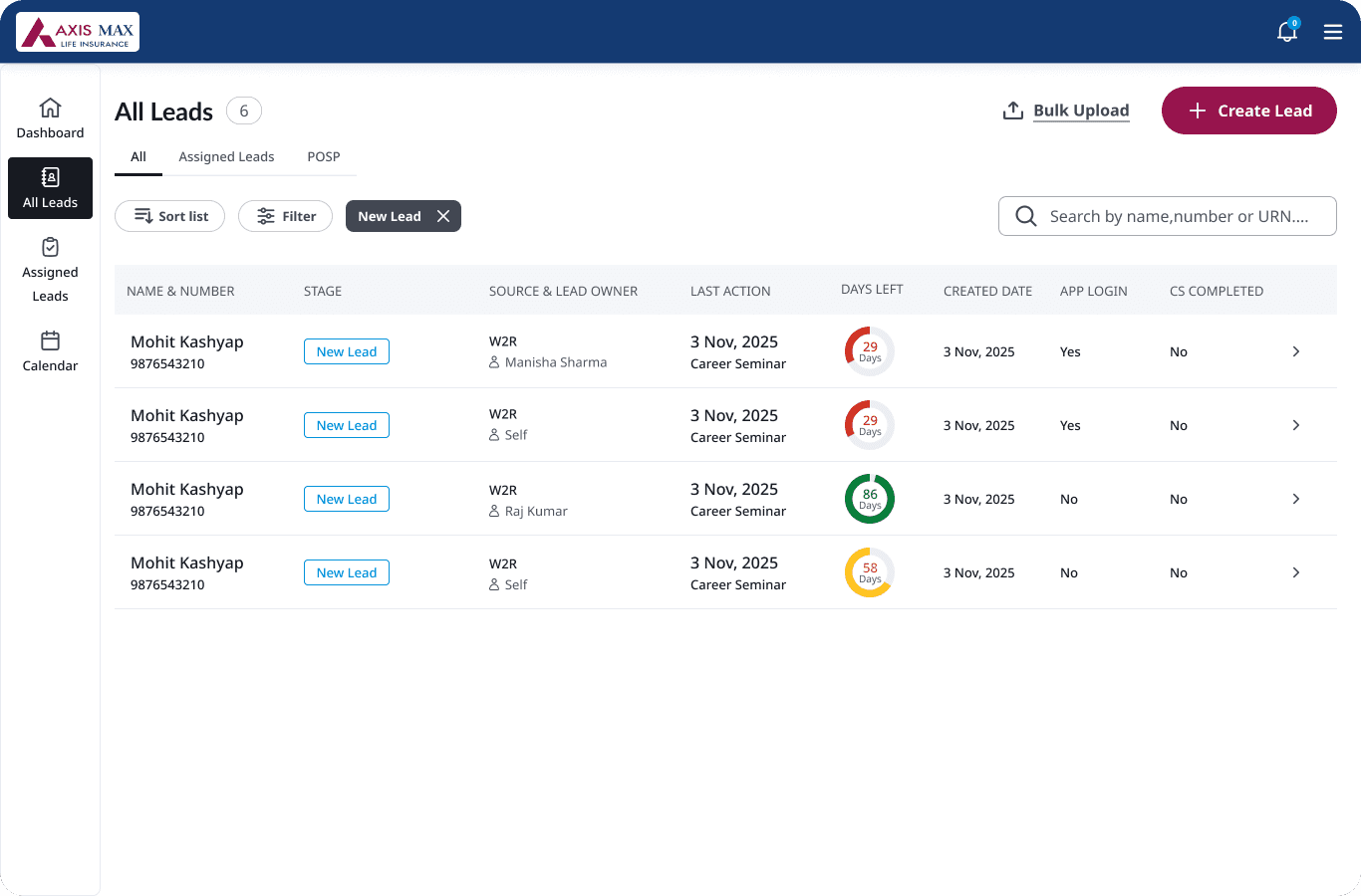
Decision 1 — Establish one visual language across the entire tool
The problem: Every screen in the old mRec looked slightly different. Mixed dark and light backgrounds, inconsistent buttons, legacy components accumulated over time with no coherent system underneath. The tool felt like a collection of disconnected screens rather than a single product.
What I designed: A unified visual system — consistent blue header across every screen, standardised component library, coherent icon weights and spacing throughout. Every screen in the new mRec feels like it belongs to the same product.
Why this decision, not another: Visual inconsistency isn't just an aesthetic problem — it creates cognitive load. Every time a user switches screens and the interface looks different, their brain has to re-orient. That's a tax on attention that accumulates across dozens of daily interactions. A consistent visual system removes that tax entirely. ADMs can focus on the candidate, not on decoding the interface.
The trade-off: Establishing a new visual system meant every screen needed to be redesigned, not just the problem areas. That was the right call — a partial visual update would have left some screens inconsistent with others, which is worse than a consistent old system.

One visual language across every screen. The tool finally felt like one product.
Decision 2 — Give ADMs a map of the entire recruitment journey
The problem: The old mRec had no journey structure. ADMs were inside individual screens with no sense of where they were in the overall process — what stage a candidate was at, what had been completed, what came next. Managing 20 candidates across 8 stages with no map is an impossible cognitive task.
What I designed: A clear stage-by-stage structure visible across all 8 recruitment stages. A dashboard showing every candidate's position across the full journey at a glance. Each stage has its own structured screen set with consistent layout so ADMs always know where they are. Progress is explicit, not implied.
Why this decision: Recruitment is not a linear task — it's a portfolio management task. At any given time, an ADM might have 5 candidates at First Call, 3 at Career Seminar, and 2 at Onboarding. The tool needs to surface that state clearly, not require ADMs to remember it. The map is the product. The individual screens are the detail.
Impact at this stage: ADMs can now see their entire pipeline at a glance. The dashboard became the starting point for every working session — not a screen they navigated past to get to the real work.


Friction reduced


Phase 2 — Prospect portal
Decision 4 — Build the prospect portal from scratch
The problem: Prospects were entirely dependent on ADMs updating them. Many didn't know what stage they were at, what documents to prepare, or what was coming next. They lost momentum during the gaps between ADM follow-ups. And those gaps were costing the ADM side too — prospects who arrived at stages unprepared caused delays that added time to the entire URN process.
What I designed: A separate prospect-facing portal — a new product that had never existed before. Prospects could now see their current stage highlighted on the full journey timeline, understand what that stage involves, and know exactly which documents to prepare before it.
Why two products, not one: The ADM's need and the prospect's need are fundamentally different. ADMs need pipeline management — multiple candidates, multiple stages, dense data. Prospects need personal clarity — one journey, their own progress, simple next steps. Combining these into one tool would have required compromising both experiences. Separate products, connected data.
Why this matters beyond UX: The lead-to-URN delay wasn't just an ADM-side problem. Every time a prospect arrived unprepared or lost momentum between stages, it added time to the ADM's process. Giving prospects visibility removed an entire category of back-and-forth that was silently extending the recruitment timeline.
The honest trade-off: I designed the prospect portal without ever speaking to a real prospect. The portal was built around what business said candidates needed — not direct user research. That's a gap. The usability testing that followed surfaced exactly how real that gap was.

Usability testing — what changed
We tested with real agents across three rounds. Four findings directly changed what shipped.
Category 1 — Labels that meant something different to us than to users
We named things based on internal logic. Users had different mental models.
What this taught me: Internal terminology is invisible to users. Every label that made immediate sense to us had been filtered through months of product context. Users had none of that context. Plain language isn't a nice-to-have — it's the difference between a user completing a step and a user stalling.
Impact
8–12% projected recruitment conversion uplift Both products live · Data maturing
The drop-off points addressed — no journey map, no prospect visibility — directly map to where candidates were leaving the funnel.